By far, the most—and basically only—question I am asked with regard to my role as Chronogram's art director is, "How do you choose the covers?"
The short, true version is: I know it when I see it. Every time I've veered from a first impression I've wished I hadn't. There are dozens of submissions every month, and even if we published daily, we would never run out of worthy work—there is that much great art surrounding us.
Of course, my gut is informed over time by my thoughts, and by the culture that surrounds me. I cannot help but consider the time of year—shared contexts like seasons, holidays, or memorable anniversaries. I try to be aware of what covers have come before and what may be coming after. Paintings, photographs, sculptures, collage...I have even been known to color coordinate adjacent months. Not always, as you will see from the imperfect color spectrum on this month's cover.
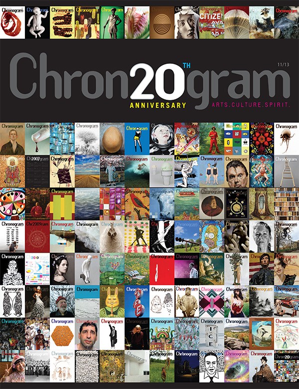
In looking back over our track record (in my case, 100 covers) I can see where I was successful, and can even recall what the sublimated logic may have been behind my instinctive choices. And since I have the opportunity, I'll tell the stories of three of the covers I chose. They all felt differently, but they were all equally right.
In December 2011, I was searching for something that would encapsulate the feeling of a new year. I wanted something that delivered a spiritual lift. Norman Rockwell's Golden Rule painting, with its injunction to "Do Unto Others As You Would Have Them Do Unto You," was a way to start afresh with every moment it was recalled. The cropped image revealed another subtle relevancy—there are 12 main faces featured, varied like the months of a coming year.
When Levon Helm began his trip up to the great drum throne in the sky, I knew there was something we could pass on to all of those who would be celebrating his life in the months (and years) to come. When I reached out to photographer Catherine Sebastian, there was no hesitation—our hearts were in the same place, and when I opened up the email that contained the image that became the 5/12 cover, I heard Levon speak to me like he was sitting there. "Hi, time to get to work!" So we did. Catherine and I looked at hundreds of images in every format, but I already knew Levon would be waving both hello and goodbye on May 1st.
Sometimes the cover is so wrong that it's perfect. There may have been a slight incline of the head toward Halloween with Michael X. Rose's Yeti Throwing My Great Grandfather from Mount Washington, British Columbia, 1913, which ran on the 10/12 issue, but it was the absurdity that drove us to do it. Even now I laugh out loud when I look at the faux wood-burned effect we achieved for the masthead. Forget about the tiny Yeti and his little fists. There can be more genius in one absurd moment than in a thousand calculated steps. This was one that made it to the public.
There are 97 other tales I could spin about all the forces that conspired to bring about these little covers that could. What we know about what we do is important, and I am usually up for sharing. Keeping it short and true, I'll tell you this: They all came from the heart.