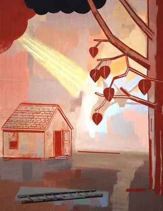
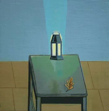
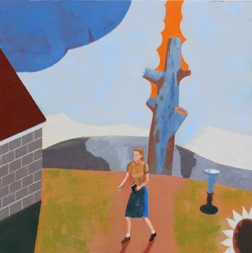
David Hornung’s oil and gouache paintings bear a kinship to comics, Japanese and Chinese woodcuts, Indian miniatures, and American folk art. The small-scale works are disarming in their spare, rustic iconography, set in elemental landscapes that frame cosmological phenomena—a dark cloud emitting light rays, atmospheric shifts, a starburst on the horizon—like abstracted stage sets. Each painting has the force of epiphany, yet there is nothing overwrought in these deadpan representations. Rather, it’s the odd combination of different visual languages that cause the shock and surprise, the depiction of impossible occurrences we can yet believe in. The juxtaposition of the diagrammatic with the atmospheric, the literal with the abstract, the cartoonlike with the naturalistic creates ambiguities in scale, space, and time that seem knowable, true to our mental experience. His paintings are inscrutable, yet they have a dreamlike logic, a psychological poignancy.
Hornung paints in a studio on a wooded hillside in Shokan, not far from the garden and house he shares with his wife, cellist Abby Newton. The sphere of his influence extends far beyond this reclusive setting, however. He is a dedicated teacher and talented author whose book, Color: A Workshop for Artists and Designers (McGraw-Hill, 2004), is available in five languages. Earning his MFA from the University of Wisconsin in 1976, Hornung has taught art for more than 30 years and is currently associate professor and chair of the art and art history department at Adelphi University, commuting from an Upper West Side apartment during the school year.
Hornung was a reviewer for ARTnews and has published many essays on art. He has lectured all over the country on art, color, and quilts (in an earlier phase of his career, he constructed art quilts). Recently, he collaborated with poet Susan Sindall on a collection of her poems called Corona, contributing his white-on-black drawings. His paintings can be seen in his one-man show at John Davis Gallery, in Hudson, which runs through August 16. Portfolio: www.johndavisgallery.com.
DAVID HORNUNG ON HIS WORK
Psychological Sign Language
I’m not that interested in verisimilitude, although I love good realist painting. I’m really more interested in the conceptual aspects of pictorial construction. Also, the psychology of the way we look at things. The other thing is, there’s this religious thing. I’m really interested in icon painting, the idea that if you stylize something it tends to be more emblematic.
The important thing is the painting disagrees with itself and yet it seems to come together as a kind of psychological whole. It’s almost like the mind craves cohesion, craves meaning and understanding, and I try to create a tension against that. I try to pull that apart or challenge it. That’s what gives the painting a kind of snap, its visual interest.
First Taste of Art
I was Catholic until I was six. My mother was a devout Catholic. When I was a little kid she was always dragging me to church. That was my first touch of art. The church left a deep visual impression on me. I think my interest in emblematic art all comes from that. I loved it, I was mesmerized; it’s quite a show, the Catholic Church.
A Ticklish Enigma
This sounds incredibly pretentious, but the truth is, if I were to talk about what my subject is, to sum it up I’d say it was the enigma of being. Simple as that. That’s what I’m interested in. My idea about what’s right in the picture is always measured against that standard. There has to be a level of ambiguity. There has to be a level of precariousness, of all kinds. But it also has to be directed, and matter-of-fact.
One of my cardinal rules in painting is, if I’m not surprised, no one else is going to be. Some would argue you can manipulate a viewer; I guess illustrators do this a lot. I can’t do it that way. If I’m going to make a surprising image, I have to literally surprise myself. Tickling yourself is an impossibility, but it’s the standard, it’s what you’re trying to do.
Painting without Thinking
If I’m really painting a lot, I stop thinking altogether. My hands just do the work. I put 10 paintings on the wall and I look at them and adjust them to each other, and make one or two changes now and then. I’ve been painting since I was 15, and [over the years] you develop highly developed preferences.
Teaching Color
As early as 1984, when I was at Skidmore, I started teaching color. [Josef] Albers was a huge influence on me when I was young. The whole idea about the Bauhaus as an educational model always intrigued me. Students are really experimenting. They’re not there to make art, they’re there to discover. That can happen in contemporary art education in something like a color class.
I’ve taught the class to graphic designers, painters, illustrators, textile designers. I can teach anybody how to use color consciously and sensibly, but the people who get the most out of my courses are people who already are good colorists. I try to get them to a conceptual matrix, [which] empowers them to make their color choices more sophisticated. And more varied; they become less repetitive because they’re able to think about it at some little distance. That’s really the key. [For other students, it’s like] music lessons: You can’t turn someone who has no inherent musicality into a real musician, but you can teach them to play the notes, feel a sense of accomplishment, and enhance their appreciation. In that sense, it’s a very valuable thing.
Simple Images/Complex Idiom
I like things to be as spare and simple and direct as they can be, if they can still yield meaning. It’s almost like the writing of Raymond Carver. There’s something very declarative. He just lets the words construct the reality; he doesn’t milk it.
[My iconography] tends to be rural in nature rather than urban. It tends to be prototypical objects, [such as] rude buildings and tools. I like dividers, like fences and walls, because they’re really useful in painting, to push the space together and direct the eye. The iconography ensures a wealth of shape vocabulary.
This particular show of my work was preceded by six months, at least, of pure failure. It took me a long time to find the right kind of attitude pictorially. I’m almost there, [in deciphering] what are the variables I can work with, what is my language?
Graphic Influences
The visual language comes from Chinese woodcuts, comic books, primitive or self-taught painting, graphic design. I’m interested in combining tonal and graphic to a degree, but the work is essentially graphic, it’s flat. [I’m a fan of] Ernest Bushmiller’s [comic strip] Nancy; I love the way he stylizes. Also Mogul miniatures: the color is such an important issue, and the space is very conceptualized and stagelike. There’s a convention, but the [forms are] also powerful abstract shapes. There’s a natural reference and also an abstract relationship. That’s exactly what I want to do.
Musical Parallel
Some artists work with language as a model. They’re interested in delivering information. [But] I think painting is a very poor informational delivery system. I see the painting as more akin to music than to language. The only form of language it relates to at all is poetry. Painting has a subverbal form of reasoning—it has cohesion and intelligence, demands and rigors, but at the same time it has a very direct conduit to the emotional life and psychological life of the viewer. My reason for making this is very akin to a sax player working out what phrase to play next and how to phrase it.
Missionary Work on the Island
I love my job [at Adelphi University]. I’ve been able to hire who I’ve wanted to work with, and we’ve built a really good BFA program in visual art. We’re working mostly with kids with backgrounds not steeped in fine art. Most of them have never been to a museum, even though they come to us as art majors. It’s typical of contemporary American life. Visual art is a very marginal activity and so we have the opportunity to do really good missionary work, and make a difference in the lives of these young people.
Make a Move
A good painting is like a good chess move. The game of chess is so ingenuously devised that if you make a move, unless you’re a chess master, you understand only a few ramifications of the move. Then the combination of moves becomes geometrically amplified. Painting’s like that. If you’ve created a good sense of variables that are lively, and work with good shapes, and work consciously and diligently, it’s like chess: You make a move and it will have felicitous ramifications that go beyond your intent. And that’s good painting, really—where things start happening that are bigger than you are.

This article appears in August 2009.